
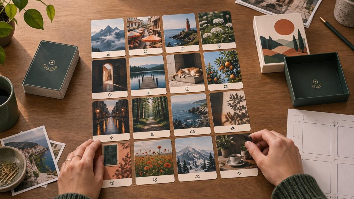
TLDR
A successful photo playing cards custom deck starts with a card plan, not a folder of favorite pictures. Decide what the deck must do, assign an image to every card, download the current production template, and crop each photo at its final placed size. Keep faces, captions, ranks, suits, and other essential details inside the printer-defined safe area while extending expendable background through the bleed. Check the entire deck at thumbnail size and approximate physical size before ordering a proof.
The central challenge is consistency. A photograph can look excellent on a phone and still fail on a small card because the subject becomes tiny, a rounded corner clips a face, or the rank disappears into a bright background. Preparing a photo playing cards custom deck means treating the photographs as parts of one handled object rather than as dozens of independent images.
Start with the deck’s actual job
Define how people will use the deck before choosing photographs. A playable deck needs immediately recognizable ranks and suits. A wedding keepsake may prioritize portraits and names. A teaching deck may need categories, captions, or numbered sequences. A custom game may require repeated card types rather than a different photograph on every face.
| Deck purpose | Image priority | Information priority | Handling concern |
|---|---|---|---|
| Familiar card games | Clear subjects that do not compete with indices | Consistent ranks and suits | Fast recognition in a fanned hand |
| Gift or keepsake | Emotionally important people, places, and moments | Optional dates or short captions | Images should reward close viewing |
| Teaching or activity deck | Simple images with one obvious subject | Labels, categories, or instructions | Frequent sorting and repeated use |
| Custom game | Artwork that communicates card roles | Rules, values, icons, and card identity | Quick scanning during play |
| Event or promotional deck | Recognizable event or organization imagery | Useful branding without obscuring play information | Packaging and repeat use after the event |
A full custom photo deck generally means that individual card faces are deliberately planned, even if some photographs repeat. That is different from placing one custom image on the back of an otherwise conventional deck. Write down which faces will be unique, which will repeat, and whether you need jokers, title cards, instructions, or reference cards. Confirm the supported card count and front-and-back configuration with the selected printer before building the final sequence.
Choose the format before making final crops
Card proportions determine how much of every photograph survives. Packaging and corner shape can also affect composition, so select the intended product and obtain its current template before final image editing. Do not assume that dimensions or guides from another printer apply to your order.
Orientation is especially important when the source folder mixes phone portraits, horizontal group photographs, square social-media images, and scans. The guide to portrait and landscape custom card layouts explains how orientation affects the composition, hand position, and available layout space. Make this decision before adding captions or decorative frames.
Stock and finish should follow the deck’s use rather than drive the initial photo selection. A deck that will be shuffled regularly has different priorities from a commemorative set that will mostly be viewed or displayed. Once the image system is stable, compare the handling and print considerations discussed in the guide to card stock for custom playing cards.
Build a complete deck map
Create a spreadsheet or contact sheet with one row for every card. This catches missing faces and accidental duplicates much earlier than reviewing exported files one at a time.
- Card ID or sequence number
- Rank, suit, category, or card function
- Source photograph filename
- Intended crop or focal subject
- Caption or other text
- Front design status
- Back design assignment
- Permission or approval status
- Final export filename
- Proofing notes
Use filenames that sort in the intended order. A consistent pattern such as 001-title, 002-card-name, and 003-card-name makes it easier to compare the export folder with the deck map. The precise naming rules depend on the printer’s upload workflow, so check those requirements before exporting hundreds of files.
For a game rather than a conventional playing-card deck, test the information architecture before investing time in polished photo treatments. A rough version can reveal whether players can identify cards, read captions, and understand categories. The workflow for building a card game prototype is useful when photographs support gameplay rather than serving only as decoration.
Select photos that work at card scale
Choose images with a clear focal subject, useful contrast, and enough surrounding space to accommodate the card’s proportions. A tightly cropped face may leave no room for rounded corners or an index. A wide group shot may preserve everyone but make each person too small to recognize.
Review promising images as small thumbnails. If the subject disappears at that scale, consider a tighter crop, a different photograph, or a layout that enlarges the important detail. This is practical editorial judgment rather than a technical pass-or-fail rule, but it exposes weak selections quickly.
Mixed image quality can still look intentional when the deck uses a consistent system. Repeated frame dimensions, caption positions, color treatments, index locations, and background styles can unite photographs from different cameras and decades. Avoid heavy correction that erases the character of older photographs unless visual uniformity is essential to the project.
Crop every image against the production template
A card template normally distinguishes bleed, trim, and safe areas. Bleed is the artwork extending beyond the finished edge. The trim line indicates the intended cut. The safe area keeps essential content away from edges where normal cutting variation could threaten it. PrintNinja’s own card setup guidance illustrates these production concepts and warns that backgrounds should extend into bleed while important content stays protected; its measurements are specific to its service and should not be transferred to a different printer.
Place faces, hands, landmarks, logos, captions, ranks, suit symbols, and meaningful photo edges inside the safe area shown on your selected printer’s current template. Extend noncritical background through the bleed. Also inspect the rounded-corner shape: content that technically fits inside a rectangular trim boundary can still feel crowded or be visually clipped near a curved corner.
Photoshop’s Crop tool can use specified width, height, and resolution settings, and custom crop presets can be saved for repeated use. That can make a large deck more consistent, provided the preset matches the current production template and does not substitute for checking each composition individually. Adobe’s Crop tool documentation
Handle landscape and square photos deliberately
Do not automatically shrink a horizontal photograph until it fits inside a portrait card. That often produces a large empty field around a tiny subject. Better options include cropping around the main subject, using a planned frame, extending a simple background, dividing the image across an intentional collage, or selecting another photograph.
Whichever method you choose, repeat it as a recognizable design rule. One framed landscape image can look like a workaround; a series of consistently framed landscape images looks like a system.
Check resolution at the final placed size
Print quality depends on the relationship between an image’s pixel dimensions and the size at which it is placed. Changing a resolution label alone does not create new detail. Adding or removing underlying pixel data requires resampling, which is a separate operation.
Adobe advises using 300 PPI for best print quality unless the printer specifies another requirement. Its guide to print dimensions and resolution also explains how dimensions, resolution, and resampling interact. Treat 300 PPI as a useful starting baseline, then follow the requirement attached to the actual card product.
To estimate effective resolution, divide the image’s pixel width by its placed width in inches, then repeat the calculation for height. For example, an image placed at 2 inches by 3 inches would need about 600 by 900 pixels to reach 300 pixels per inch in both directions. This is an illustrative calculation, not a card-size specification.
Inspect the cropped image at its final placed dimensions, not only as the uncropped original. A large source file can become inadequate after an aggressive crop removes most of its pixels. Conversely, a modest file may be perfectly usable when the final printed image is small enough.
Protect playability with a consistent information layer
If the deck is meant for familiar card games, preserve conventional scanning behavior: ranks and suits should appear in consistent positions, maintain strong contrast, and remain legible when several cards are fanned in one hand. Decorative typography should not make a six resemble an eight or allow a photograph to swallow a red suit symbol.
A subtle panel, gradient, outline, or solid index zone can separate play information from a busy photograph. Test both light and dark photos because one fixed text color rarely works equally well over every image. Mirrored indices may also matter if players expect cards to be readable from either orientation.
Keep the back shared unless intentionally different backs are part of the game system and the printer supports them. In ordinary play, visible back differences can reveal card identity. For keepsakes, a common back also gives a visually varied stack a stronger sense of unity.
Avoid the thin-border trap
A hairline border demands extremely even trimming to appear balanced. Small positional differences become obvious when one side looks thicker than the other. PrintNinja specifically cautions that narrow borders can expose cutting variation in card production.
Full-bleed photography is often the least visually sensitive choice. If the deck needs a frame, use one generous enough that minor variation will not dominate the design. Another option is an intentionally irregular or layered edge treatment that does not rely on perfect symmetry.
For additional background on production vocabulary while interpreting a printer’s instructions, see the general printing resources at Printiverse. The selected product’s current template should still control the actual file setup.
Proof the deck as one physical object
Proofing is not just checking whether each photograph looks attractive. Review the whole sequence for duplicate files, missing cards, inconsistent indices, mismatched fronts and backs, stray template guides, and sudden changes in framing or color treatment.
- Compare every exported filename with the deck map.
- Review the deck as small thumbnails to find visual inconsistencies and accidental repeats.
- Inspect each card at approximately its intended physical size for subject recognition and text readability.
- Confirm that essential content remains inside the current template’s safe area.
- Check dark photographs for lost detail and light photographs for weak indices.
- Remove or hide guide, dieline, note, and template-instruction layers as required by the printer.
- Verify that the box or other package is intended for the chosen card size, card count, and stock.
- When available and appropriate to the budget, review a proof or sample before committing to a larger quantity.
A physical proof is particularly useful for a deck intended for repeat handling. Evaluate whether captions can be read comfortably, whether cards fan and shuffle as expected, whether the photographs remain distinct under ordinary room lighting, and whether the completed stack fits its package without excessive movement or compression. These are use-case checks, not claims that one stock or finish is universally best.
Complete a rights and privacy check
Confirm that you have permission to reproduce every photograph, illustration, logo, and other graphic. Pay particular attention to professional photographs, client work, school or club images, private events, and photographs involving children. Permission to possess or post an image does not automatically settle every intended reproduction use, so resolve questions before sending the files to production.
Pre-order checklist for a photo playing cards custom deck
- The deck’s purpose and audience are defined.
- The selected product’s current template has been used.
- The required card count and package capacity are confirmed.
- Every card appears in the deck map and export folder.
- Unique and repeated photographs are intentional.
- Important subjects, captions, ranks, and suits remain inside the safe area.
- Background artwork reaches the required bleed.
- Rounded corners have been considered in every crop.
- Resolution has been checked at final placed size.
- Ranks and suits remain readable over both light and dark photographs.
- Thin borders do not depend on perfectly centered trimming.
- Front and back assignments have been verified.
- Template guides and instruction layers have been handled as required.
- Reproduction permissions and privacy concerns have been addressed.
- The complete deck has been reviewed at thumbnail and approximate physical size.
- A proof or sample has been assessed when the project warrants one.
Make one card system, not a stack of separate photos
The most useful next step is to build the deck map and download the correct production template before editing the full image set. Prepare three representative cards first: one easy portrait, one difficult landscape image, and one text-heavy or gameplay-critical card. If those three share a clear visual system and remain usable at physical size, apply the same rules to the rest of the deck. That small trial will reveal crop, contrast, resolution, and layout problems while they are still easy to correct.