
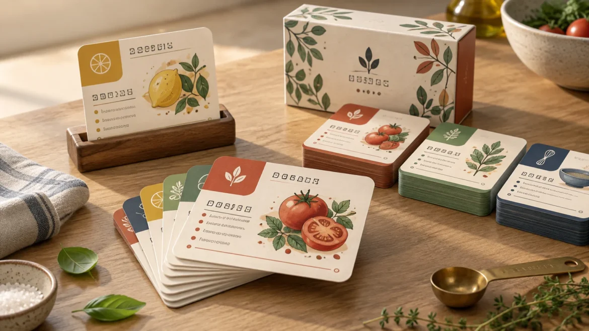
TLDR: Treat a recipe deck as a working kitchen reference, not a miniature cookbook. For custom recipe card deck printing, choose a format that accommodates your longest common recipes at a comfortable type size, keep essential information in fixed locations, label categories with words as well as color, and prototype representative cards at actual size. Settle the card size and final count before designing the package, then build every print file from the selected printer’s current template.
The central challenge in custom recipe card deck printing is fitting enough information on each card without making the cook hunt, squint, or handle an awkward stack. A successful deck should let someone identify a recipe, check the ingredients, follow the method, and return the card to the correct section with minimal friction. That makes information hierarchy, card orientation, stock opacity, and packaging functional decisions rather than decorative afterthoughts.
Start with the job of the recipe deck
Define how the deck will be used before choosing dimensions or artwork. A family archive may need generous notes, substitutions, and attribution. A compact gift deck might contain short drink, snack, or dessert recipes. Classroom cards may require large type, numbered instructions, allergy information, and space for handling. A retail deck also needs a coherent visual system and packaging that communicates what is included.
Write a one-sentence use statement. For example: “This is a 40-card weeknight dinner deck that an adult cook will read from a counter while preparing food.” That sentence establishes the likely recipe length, audience, reading distance, card count, and environment. If the statement instead describes a child following classroom instructions, the layout and language should change substantially.
Also decide whether the cards will be read one at a time, spread across a counter, placed in a holder, or sorted into weekly groups. Portrait cards fit some holders and ingredient lists naturally, while landscape cards can provide longer lines and a side-by-side ingredients-and-method structure. There is no universally best orientation; the right one follows the content and handling pattern.
Choose a size by testing real recipes, not empty templates
A standard playing-card footprint is usually restrictive for a complete recipe containing an ingredient list, timings, and several method steps. Larger specialty formats provide more room, but they also occupy more counter space and produce a larger package. As examples of formats available in the custom-card market, one manufacturer lists 4 × 6-inch and 5 × 7-inch options, while its large-card product measures 3.5 × 5.75 inches, or 89 × 146 mm. These examples do not establish what another printer offers, so confirm the exact dimensions available for your selected product.
Choose among candidate sizes using three representative recipes: a short recipe, a typical recipe, and one of the longest recipes expected in the deck. Place all three into the proposed layout without shrinking only the difficult card. If the long recipe becomes cramped, the format is too small, the writing needs editing, or the recipe needs a planned continuation.
| Format decision | Works best when | Main tradeoff |
|---|---|---|
| One recipe on one side | Recipes are short and image space is limited | The reverse can carry a common back, but the face may become crowded |
| One recipe across front and back | Recipes need moderate space and cards are handled individually | The cook must turn the card during preparation |
| Recipe plus continuation card | A few recipes are unusually long | Cards can become separated unless clearly numbered |
| Larger card format | Most recipes contain several ingredients and steps | The deck and package become physically larger |
Using both sides is often preferable to forcing dense copy onto one face. A practical division is identification, timing, yield, and ingredients on the front, with the numbered method and notes on the back. Put “Turn over for method” in a predictable position. For a continuation card, repeat the recipe title and mark both pieces clearly, such as “1 of 2” and “2 of 2.”
Build a repeatable recipe-card hierarchy
Every card should answer the same questions in the same order. A useful hierarchy is title, yield, preparation and cooking time, ingredients, numbered method, and optional notes or substitutions. Consistent placement reduces the amount of visual searching required when a cook moves from one recipe to another.
- Put the recipe title where it remains visible in a card holder or partially spread deck.
- Keep yield and timing close to the title rather than burying them in notes.
- Separate ingredients visually from the method.
- Use numbered steps when sequence matters.
- Write temperatures with units and make distinctions such as teaspoons versus tablespoons unambiguous.
- Reserve a consistent area for allergens, substitutions, storage notes, or source attribution.
- Use the same terminology and measurement style throughout the deck.
Decoration should support that structure. Photographs, borders, illustrations, and patterns can establish personality, but they should not compete with quantities or instructions. Avoid placing body text directly over a detailed image. If an image must sit behind text, provide a solid or sufficiently quiet text panel rather than expecting every photograph to offer reliable contrast.
Make readability survive the kitchen context
Recipe cards are often read at arm’s length rather than held close like a novel. Actual reading conditions can include angled light, brief glances, flour-covered hands, or a card sitting below eye level. The design therefore needs comfortable type, strong contrast, short steps, and visible landmarks.
There is no single mandatory type size for every recipe deck. However, accessibility guidance is useful when the audience includes readers with low vision. The American Printing House for the Blind defines large print in its guidance as 18 points or larger and advises against serif type, patterned text backgrounds, and distinctions that rely only on color. That is guidance for large-print documents, not a universal minimum for all cards, but it illustrates why a spacious layout may be necessary for an accessibility-led deck. Readers planning such a project can consult the American Printing House for the Blind large-print guidelines.
Choose type at the intended physical size, print it, and view it from the expected distance. A point size that appears comfortable on a zoomed monitor can feel quite different on a printed card. Check numerals especially carefully: 1, 3, 5, and 8 must remain distinct, and fractions should not collapse into tiny marks.
Category colors can make sorting faster, but color should not carry the entire meaning. Pair each color with a label or symbol, such as “Breakfast,” “Main,” or “Dessert.” This preserves the classification when cards are printed in imperfect conditions or used by someone who cannot readily distinguish the selected colors.
Plan for handling, sorting, and repeated use
The deck’s physical behavior depends on more than the face design. Card dimensions, stock thickness, finish, corner treatment, and count all contribute to how the stack feels. A recipe deck may not need the same shuffle characteristics as a playing-card deck, but it should be easy to remove one card, spread several choices, and return cards to the correct category.
Consider adding category dividers only if they provide enough room for visible tabs or labels. Otherwise, use category cards with bold headings and an index card at the front. Numbering recipes can also help users restore order after spreading several cards across a counter.
When comparing stock, examine the printer’s documented thickness, composition, opacity, coating, and available finishes. Opacity matters when both sides contain information because show-through can interfere with reading. For example, one manufacturer states that its M29 linen stock uses a blue core intended to reduce show-through. Treat that as a property of that named product, not proof that linen or blue-core stock is automatically best for every recipe deck. For a broader explanation of how stock properties affect cards, see choosing card stock for custom playing cards.
Do not assume that a coated or laminated-looking card is waterproof, oil-proof, wipe-clean, or safe for a dishwasher. Those are specific performance claims that should come from the printer’s documentation. If kitchen exposure is a concern, ask what the manufacturer actually states about the selected material and finish.
Set the card count before designing the package
Packaging must accommodate the chosen card dimensions, total stack thickness, dividers, instruction cards, and any desired finger clearance. That means packaging artwork should begin only after the deck specification is stable.
Available box templates can be tied closely to card count. One manufacturer’s large-card rigid-box templates, for example, include separate versions for 56, 72, 88, and 104 cards. This does not mean those capacities are universal. It demonstrates why “approximately 70 cards” is not an adequate final packaging specification.
A tuck box is compact and familiar, but its fit must be matched carefully to the stack. A rigid box can create a presentation-focused gift or retail object, though it adds size and production complexity. A belly band or simple card band may suit a small prototype or informal gift deck, provided it holds the cards securely enough for the intended use. Confirm every structure against an actual packaging template rather than drawing a box around the card faces.
Prototype the difficult cards at actual size
A prototype should answer practical questions before a full order. Print at 100 percent scale, trim the cards, stack enough sheets to approximate the deck, and use the cards in the position for which they were designed. The goal is not to simulate the final stock perfectly; it is to expose layout and handling problems while they are still inexpensive to correct.
Include a deliberately varied prototype set rather than choosing only the cleanest designs:
- The longest recipe and the shortest recipe
- A card with several fractions and similar-looking quantities
- A recipe containing a long ingredient name
- A card with substitutions, allergy information, or storage notes
- One card from every category color
- Both halves of any two-card recipe
- A divider, index, or instruction card
- The proposed front and back designs printed together
Place a sample card on a counter, in any intended holder, and beside common kitchen objects. Check whether the title remains visible, whether the next step can be found quickly, and whether turning the card is comfortable. Ask a few intended readers to locate the yield, one ingredient quantity, and a specified method step. Confusion points are layout signals, not user failures. This follows the same test-first principle described in building a card prototype before paying for a full print run.
Prepare files from the selected printer’s template
Bleed is artwork extending beyond the final cut line so minor cutting variation does not leave an unintended white edge. The safe area is the inner region where important text and symbols are kept away from trimming and corner rounding. Exact values are product-specific.
For one poker-size product, MakePlayingCards specifies a minimum image resolution of 300 dpi, a 1/8-inch bleed, and a further 1/8-inch safe margin inside each edge. Those figures are an example, not a reusable specification for every card or printer. Download the current template for the exact card size, corner option, and packaging product being ordered.
Complete a final preflight before uploading:
- Confirm finished dimensions, bleed, safe area, resolution, color settings, and accepted file format against the current template.
- Keep titles, quantities, category labels, and card numbers inside the safe area.
- Extend full-bleed backgrounds and images through the bleed boundary.
- Check that every front is paired with the correct back and uses the required orientation.
- Verify that fractions, degree symbols, punctuation, and special characters rendered correctly.
- Confirm consistent measurement terminology, capitalization, and step numbering.
- Recalculate the final card count, including dividers, index cards, acknowledgments, and blanks.
- Use the packaging template that matches the final card dimensions and count.
- Review a digital proof, but do not let it replace the actual-size paper prototype.
A practical recommendation
Start with the longest ordinary recipe, not the cover art. Give that recipe enough room for readable ingredients and numbered steps, then test the resulting card at actual size. If it works without unusually small type or crowded edges, apply the hierarchy to the rest of the deck.
Once the layout survives that test, finalize the count, select a documented stock and finish, and choose packaging built for the resulting stack. Custom recipe card deck printing works best when size, typography, handling, and packaging are treated as one connected system. The immediate next step is simple: format three representative recipes, print them at 100 percent scale, and identify what becomes difficult before committing to production.