
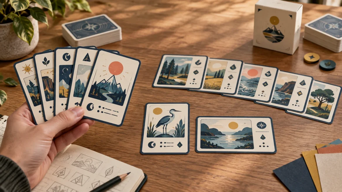
TLDR: Choose portrait for cards that players regularly hold, fan, and read from a conventional hand. Choose landscape when cards primarily sit on the table, need a wider visual composition, or organize information into horizontal zones. When comparing portrait vs landscape custom cards, remember that rotating a card swaps its usable width and height; it does not create additional surface area.
The right choice depends less on appearance than on use. Test the largest expected hand, the full table layout, the information visible while cards overlap, and the intended box. Do that before commissioning final artwork, because changing orientation late can affect every title, icon, illustration, text block, card back, and packaging panel.
Portrait vs landscape custom cards at a glance
| Design situation | Usually start with | Why |
|---|---|---|
| Players hold and fan several cards | Portrait | The narrower upright width generally makes a multi-card hand easier to spread, while familiar top-corner indexing can remain visible. |
| Cards stay face-up in rows | Landscape | The reduced upright depth can make horizontal rows shallower, although each card consumes more row width. |
| Artwork has a tall subject or vertical sequence | Portrait | Characters, buildings, trees, and stacked information often fit a vertical composition naturally. |
| Artwork shows a scene, map, timeline, or wide diagram | Landscape | The wider frame gives horizontal subjects and side-by-side information more room. |
| Cards use long rules text | Either, after layout testing | Landscape supports longer individual lines; portrait supports a taller text column. Actual readability depends on type size, line length, spacing, and competing elements. |
| The deck mixes held cards with table boards | Consider separate formats | A single orientation need not serve every component, particularly when different card groups are never shuffled together. |
These are starting points, not universal rules. A compact landscape hand can work, and a portrait tableau can be efficient when cards overlap vertically. The decision should follow the most demanding moment in play rather than the most attractive isolated card mockup.
Rotation changes dimensions, not card area
Consider a finished card measuring 63 × 88 mm. In portrait orientation it is read as 63 mm wide by 88 mm high. Rotated to landscape, it becomes 88 mm wide by 63 mm high. Both versions cover 5,544 mm². MakePlayingCards lists standard and horizontal game-card products at that same finished size.
Do not assume that every product called “poker,” “standard,” or “game card” uses those exact dimensions. The same manufacturer separately lists a traditional poker size of 63.5 × 88.9 mm. That small difference is enough to make an inherited template unreliable for final production. Choose the printer and exact product first, then build the final file with its current template.
Orientation also does not change the deck’s thickness. Thickness comes from card count, stock caliper, coatings and any inserts—not from whether the faces are designed horizontally or vertically. Orientation can, however, change the dimensions and presentation of the package face.
Cards in hand: test the fan, not one card
Portrait is usually the safer starting point for a game in which players hold many cards. Its narrower upright width lets more cards fit across a fan for a given amount of overlap. More importantly, players already understand the convention of looking for information near an upper corner.
The crucial question is what remains visible after overlap. Put information needed for selection—such as cost, category, rank or suit—in the exposed edge or corner. The Game Crafter publishes rank-and-suit template variants intended for left fanning, demonstrating why fan direction can affect index placement. If players may fan in either direction, consider mirrored indices or another layout that does not depend on one hand.
Landscape cards are not automatically uncomfortable, but their 88 mm upright width makes a large hand spread farther. Heavy overlap can then hide more of each face. A landscape hand works better when players hold relatively few cards or when the visible edge contains a compact, unmistakable identifier.
Total deck count is not the deciding number. A 200-card game in which each player holds three cards can suit landscape better than a 36-card game requiring a 12-card hand. Prototype the maximum simultaneous hand, including temporary draws, drafting, trading, and end-of-round effects. The workflow in our card game prototyping guide can help separate functional tests from final visual production.
Table space changes in two directions
Landscape can save table depth, but it does not save space universally. Ten 63 × 88 mm cards placed edge to edge span 630 mm as upright portrait cards and 880 mm as upright landscape cards. In a vertical column, the relationship reverses: portrait cards use 88 mm of depth each, while landscape cards use 63 mm.
Real games rarely arrange cards edge to edge. A useful table test should include:
- The maximum number of cards expected in each row or column
- Normal gaps or overlaps between cards
- Draw, discard, market and scoring piles
- Tokens placed on or beside cards
- Player boards, mats, dice, notes and reference sheets
- Space for hands and arms around the play area
- Card rotation used to indicate tapping, exhaustion or another state
Lay out the largest plausible game state on the smallest table the game should reasonably support. Landscape is often helpful for a row of location, encounter, timeline or display cards because it reduces row depth. Portrait may be better for a market with many cards across the table because each card consumes less horizontal width.
Match the orientation to the information hierarchy
Orientation should support the order in which a player examines a card. Start by listing what must be recognized instantly, what must remain visible in a fan, what is read only after selection, and what is decorative. Then assign space accordingly.
Portrait layouts
Portrait naturally supports a top-to-bottom sequence: title and cost, artwork, rules, then secondary information. It also gives tall illustrations a strong focal axis. The risk is a narrow rules column. Long words, multiple icons, or wide diagrams may create awkward line breaks even when the total text technically fits.
Landscape layouts
Landscape supports side-by-side modules, such as artwork on the left and rules on the right. It can also accommodate maps, processes, comparisons, panoramic scenes, recipes and educational diagrams. Our guide to readable custom recipe card decks explores a use case where information structure and handling should be considered together.
A wide text box is not automatically more readable. Very long lines make it harder for the eye to find the start of the next line. Use columns, short modules, labels or constrained text widths rather than stretching prose across the entire card. Conversely, avoid shrinking type merely to preserve a large illustration. If essential text does not fit at a readable size, edit the content or change the information architecture.
Card backs deserve a separate check. A directional back can reveal that some shuffled cards are rotated 180 degrees. A rotationally symmetrical or nondirectional back avoids that issue. Mixed-orientation components can share a visual system, but cards intended for one shuffled deck should still have consistent physical dimensions and indistinguishable backs unless differences are deliberate game information.
Card count affects handling and packaging
Card count influences deck thickness, shuffling and box depth, while orientation influences the front-facing proportions of the package. Keep those questions separate. A manufacturer may support a broad range of deck quantities and several stock or packaging combinations, but those are product-specific options rather than universal limits. For example, the cited MakePlayingCards product currently lists quantities from 18 to 612 cards along with multiple stocks and packaging choices.
Never calculate the final box from card count alone. The required internal depth depends on the selected stock’s caliper, coatings, tolerances, inserts, rulebooks and box construction. Use the packaging dieline supplied for the exact card product and configuration. PrintNinja, for example, provides separate card and tuck-box templates across several formats, illustrating why card art and packaging art should be prepared from their respective files. Artists planning illustration-heavy decks may also find the packaging considerations in our custom tarot deck printing guide useful.
A landscape deck can go into a horizontally presented box, but it does not always need to. The cards may be rotated inside a conventional vertical tuck box if the physical dimensions and construction allow it. What changes is the reading direction of the box artwork and how the product is displayed on a shelf. Decide which panel should face forward before building the package hierarchy.
Use the printer’s template after choosing the format
A portrait file cannot always be converted safely by rotating the artwork. Production templates may include bleed, safe areas, cut lines, rounded-corner guidance and orientation-specific previews. Download the current template for the precise product instead of recreating it from remembered measurements.
For one cited 63 × 88 mm game-card product, MakePlayingCards specifies at least 300 dpi, a 1/8-inch bleed beyond the cut line, and an additional 1/8-inch safe margin inside it. With 1/8 inch added on every outer edge, the nominal artwork canvas becomes 69.35 × 94.35 mm in portrait or 94.35 × 69.35 mm in landscape. Those numbers apply only to that stated requirement; another printer or product may specify different dimensions, tolerances or file setup.
Keep backgrounds and borderless artwork extending through the bleed, but keep critical text, icons and faces inside the safe area. Thin borders near the cut line are particularly sensitive to normal cutting variation because small shifts become visually obvious. Stock and finish also affect handling, opacity and deck thickness, so review the card stock choices for custom playing cards before finalizing the box.
If you are comparing broader card printing options, treat each supplier’s downloadable template as authoritative for that supplier rather than transferring specifications between products.
Prototype the decision before final artwork
Print both orientations at actual size on ordinary paper, trim them, and place them in sleeves with spare cards for stiffness. Beauty is not the goal yet. You are testing reach, visibility, reading order and physical footprint. The Tabletop Game Designers Association’s prototyping guidance likewise emphasizes creating physical components, playtesting them and revising through iteration.
- Make enough rough cards to create the largest expected hand and tableau.
- Add realistic titles, icons and rules text rather than empty placeholder boxes.
- Fan the hand in both directions and note which information disappears.
- Build the complete table state with piles, tokens and player components.
- Ask players to find, compare and play cards without explaining the layout.
- Record hesitation and misreads, then revise the hierarchy before polishing the art.
- Repeat at actual size and check the final files against the selected printer’s card and box templates.
Common orientation questions
Can one game use both portrait and landscape cards?
Yes. Different orientations can distinguish component classes, such as portrait hand cards and landscape locations. It works best when the groups occupy different play areas or use separate decks. If all cards are shuffled together, prototype handling carefully and keep their physical size and backs consistent unless identification is intentional.
Does a landscape design require a new production template?
Use the manufacturer’s designated template or instructions for the chosen orientation. Even when the finished rectangle is simply rotated, the supplied file may contain orientation-specific guides, previews or required placement. Do not assume that rotating a completed portrait file is sufficient.
Which orientation is best for text-heavy cards?
Neither wins automatically. Portrait provides a taller text region; landscape provides more line width and supports side-by-side modules. Build a card containing the longest realistic text, set it at a readable size, and test it at arm’s length and in normal table lighting.
Make the choice from the hardest use case
Start with portrait when players regularly hold and fan a substantial hand. Start with landscape when cards function mainly as table displays, wide scenes or horizontally organized information panels. Then challenge that choice with the largest hand, fullest tableau, longest text and intended package.
Once the prototype works, select the exact printer product, download its current card and box templates, and rebuild the production files around those specifications. Orientation is easy to change in an early paper prototype and expensive to change after illustration, prepress and packaging are complete.