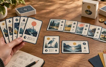
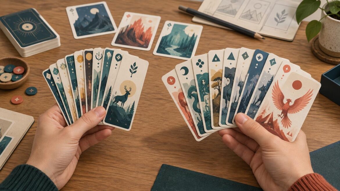
TLDR: For a card size for large hand card game design, start by prototyping portrait bridge-size cards. Their narrower width generally makes a large fanned hand easier to manage. Keep poker-size cards if the game needs dense rules text, several statistics, large icons, or artwork that becomes ineffective in the narrower format. Ten cards is a useful trigger for testing, not a universal ergonomic cutoff.
A “large hand” here means that a player holds many concealed cards, not that the cards themselves are oversized. The right choice depends on more than card count: how players fan and sort the cards, what must remain visible in the overlap, how much public information goes on the table, and whether the design still reads clearly after it is narrowed all matter.
The best card size for large hand card game designs
Bridge size is the most sensible first prototype when players routinely hold 10 or more portrait cards. MakePlayingCards lists its bridge format at 57 × 89 mm, or 2.25 × 3.5 inches. KEM likewise describes its 2.25 × 3.5-inch format as narrow and associates narrow bridge cards with games such as canasta, where players may hold many cards.
The recommendation is a starting point rather than a rule. The practical advantage comes from width: less material has to be distributed across the player’s hand. The familiar height is retained, so the cards do not necessarily feel miniature even though the fan is more compact.
A useful way to think about fan width is: card width plus the exposed step between cards multiplied by one less than the number of cards. The exposed step depends on the player and on how much information must remain visible. Narrowing a card helps, but a design that forces players to expose half of every card can still produce an awkward hand.
| Choose this starting format | When it is likely to work best | Main risk to test |
|---|---|---|
| Bridge or narrow portrait | Players routinely hold, sort, and rearrange 10 or more concealed cards | The narrower face may crowd text, icons, or artwork |
| Poker portrait | Cards need more horizontal layout room or are often read individually | A large fan may become tiring or difficult to scan |
| Landscape format | The information has an inherently wide structure | Fanning, corner visibility, and one-handed handling may suffer |
| Larger specialty format | Cards are primarily displayed and viewed publicly on the table | Hand-held play and table footprint may become impractical |
Why a narrower card helps—and why it may not be enough
Players rarely hold a large hand as a perfectly even fan. They group cards by suit, cost, action type, objective, or another game-specific category. They also compress and expand the fan while searching. A narrower card can reduce the total span and make those repeated adjustments easier, especially when cards remain concealed for much of a turn.
However, width is only one part of handling. Stock stiffness, surface finish, sleeves, corner shape, and player dexterity can all affect how readily a hand can be opened, compressed, and reordered. These variables should be checked with physical samples rather than treated as fixed outcomes. Review the practical tradeoffs in choosing card stock for custom playing cards, but test the intended stock and finish in the actual game whenever possible.
Hand size also varies substantially among players. A format that feels comfortable to one designer may be frustrating for a child, an older player, or someone with limited grip or hand mobility. Testing with a varied group is more informative than asking whether the designer alone can hold the maximum hand.
Keep poker size when the information needs the room
Poker size can remain the better choice even when hands are large. Preserve the wider format if narrowing the card makes players work harder to recognize or understand it. Common reasons include multiple statistics on one line, long card titles, several action icons, rules text that cannot be shortened, or illustration that carries gameplay information.
The distinction is between hand space and information space. Bridge size saves physical width, but it does not reduce the amount of information your game asks players to process. If the layout only works after shrinking every label and crowding the icons, the smaller format has solved the wrong problem.
Before enlarging the card, try improving the hierarchy. Put the information needed while cards overlap in a consistent upper corner. Shorten repeated instructions by defining common terms in the rules. Use distinct icon shapes rather than relying only on color. Move secondary reminders out of the primary scanning path. The goal is not to fit more content; it is to make the important content visible sooner.
Use representative cards, including the wordiest and visually busiest examples, when evaluating the layout. A spacious resource card is not a meaningful test if the finished deck also contains action cards with titles, costs, timing conditions, and exceptions. The workflow in testing card layout readability before printing can help separate hierarchy problems from format problems.
Design the overlapped edge first
In a 10-card fan, most of each card is hidden. The visible strip should therefore answer the first question the player asks while sorting. Depending on the game, that might be suit, category, value, cost, action type, or orientation.
- Place the primary index in the same corner on every card.
- Keep the index clear of decorative borders and low-contrast artwork.
- Use concise titles or abbreviated category labels where recognition matters.
- Give frequently compared values a fixed position.
- Avoid putting essential distinctions only in the center of the card.
- Test whether left-handed and right-handed fanning expose the necessary information.
- Check icons at physical size instead of judging them only on a zoomed-in monitor.
Mirrored indices may help when cards can be rotated, but they also consume layout space. Treat them as a gameplay feature rather than an automatic convention. A prototype will show whether players actually rotate cards or whether one consistently designed corner is sufficient.
Portrait versus landscape for a large hand
Portrait orientation is the safer default for hand-held cards because it supports conventional side-to-side fanning. Landscape cards can accommodate wide diagrams, tracks, or rows of statistics, but their proportions change the mechanics of the hand. Players may need to stack them more tightly, hold them in two hands, or rotate them to read content.
Landscape can still be correct when cards spend little time in a concealed hand and mostly become public displays, locations, equipment panels, or tableau elements. In that case, table readability may matter more than fan width. The detailed comparison in portrait versus landscape custom cards can help identify which orientation matches the card’s main job.
Do not choose a smaller format merely because the complete deck contains many cards. Deck size affects stack height, storage, and packaging; cards held at one time affect hand comfort. A 200-card deck with five-card hands has a different ergonomic problem from a 40-card deck in which one player may hold 18 cards.
Run a two-format physical prototype test
Build bridge-size and poker-size samples before commissioning final artwork. They do not need polished illustration, but they should include realistic titles, icons, text density, and color contrast. A rough prototype is especially valuable here because card dimensions influence gameplay behavior, not just appearance. See how to build a card game prototype for a staged approach to increasing production quality.
- Create at least one ordinary card, one dense card, and one visually similar pair in each format.
- Print at physical size and trim the samples consistently. Put them in the intended sleeves if the game will normally be sleeved.
- Build the largest routine hand, not merely the opening hand. Include temporary bonuses or draw effects that commonly increase it.
- Ask players to fan, sort, locate a named card, compare values, play a card, and return it to the correct group.
- Observe whether players use one hand or two, hide cards behind one another, place part of the hand on the table, or repeatedly drop and rebuild the fan.
- Lay out the complete shared area and one full player tableau to test table footprint and reach.
- Repeat with players who have different hand sizes, vision needs, and familiarity with the game.
- Choose the smallest format that remains comfortably readable and usable in the most demanding normal state.
Time-to-find can be a useful comparative measure, but it does not need to become laboratory research. If several players consistently locate cards faster in one version and report fewer handling problems, that is actionable prototype evidence. Also record mistakes: confusing two icons or overlooking a cost matters more than a small difference in search time.
Prepare production files only after selecting the format
Once testing identifies a format, download the current template from the printer you intend to use. Format names are not interchangeable production specifications. Cartamundi, for example, publishes its own bridge and poker dimensions and calls for 3 mm bleed and a 3 mm safe area in its workflow. Those details differ from MakePlayingCards’ guidance, which specifies 1/8-inch bleed and asks designers to keep important content another 1/8 inch inside the trim edge. Cartamundi’s technical specifications show why the selected manufacturer’s template must control the final file.
For one current MakePlayingCards workflow, the listed minimum upload canvas is 747 × 1122 pixels at 300 dpi for bridge cards and 822 × 1122 pixels at 300 dpi for poker cards. These are supplier-specific upload figures, not universal dimensions. Do not resize finished artwork to those values until you have confirmed the exact product, orientation, and live template.
Packaging comes last. MakePlayingCards provides different bridge tuck-box templates by card-count range and stock option, illustrating why card count and material both matter when selecting a box. Sleeves, inserts, rules, dividers, and manufacturing tolerances can further change the required capacity. For adjacent non-card components, general printing resources may help with broader production planning, but the card and box dielines should always come from the chosen manufacturer.
The practical recommendation
Start with portrait bridge-size cards when 10 or more cards are a routine concealed hand. Design the overlapped corner before polishing the rest of the face, and test the widest normal hand using realistic text, stock, and sleeves. Move to poker size when the bridge layout cannot preserve clear hierarchy and comfortable reading.
The winning format is not simply the narrowest card. It is the smallest format that lets players hold, sort, identify, read, and play their cards without unnecessary effort. Confirm that choice with a physical prototype, then rebuild the production files on the selected printer’s current card and packaging templates.